Percentage of the energy generate from different resources
You should spend about 20 minutes on this task.
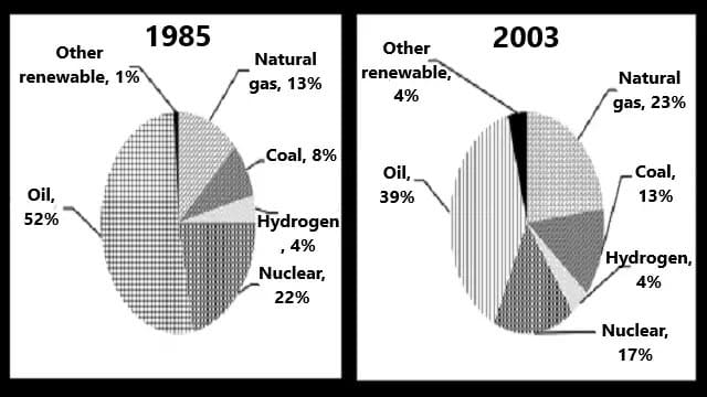
The charts below show the percentage of the energy generate from different resources in a country in 1985 and 2003.
Summarise the information by selecting and reporting the main features and make comparisons where relevant.
Write at least 150 words.

Real IELTS Exam Question, Reported On:
Practice with Expert IELTS Tutors Online
Apply Code "IELTSXPRESS20" To Get 20% off on IELTS Mock Test
| India | 24th September 2022 |
Percentage of the energy generate from different resources in a country in 1985 and 2003
The given pie charts compare the percentage of energy generated from seven different sources in a particular country from 1985 to 2003.
Overall, it can be seen that the use of some sources to produce energy increased with time, whereas that of others decreased. The maximum energy was produced from oil and the least from hydrogen and other renewable sources from 1985 to 2003.
Oil was the major source of energy production throughout the whole period, although its usage dropped from just over half (52%) in 1985 to approximately two fifths (39%) in 2003. The use of nuclear also declined from 22% to 17% over the given period.
The use of natural gas and coal showed an increase from 13% and 8% in 1985 to 23% and 13% respectively in 2003. Interestingly, the proportion of energy produced from hydrogen remained stable at 4%, whereas that from other renewable sources increased from 1% to 4% over the given period of 18 years.
Energy Generate from Difference Sources IELTS Chart
The given pie charts compare the percentage of energy generated from various sources in a particular country from 1985 to 2003. It can be seen that the use of some sources to produce energy increased with time, whereas that of others decreased.
Oil was the major source of energy production throughout the whole period, although its usage dropped from just over a half (52%) in 1985 to approximately two-fifth (39%) in 2003. The use of nuclear also declined from 22% to 17% over the given period.
The use of natural gas and coal showed an increase from 13% and 8% in 1985 to 23% and 13% respectively in 2003. Interestingly, the proportion of energy produced from hydrogen remained stable at 4%, whereas that from other renewable sources increased from 1% to 4% over the given period of 18 years.
Overall, the maximum energy was produced from oil and the least from hydrogen and other renewable sources from 1985 to 2003.
Moreover, in the green park area, people live in semi-detached and detached types of houses, rates are equal, accounting for 5% each. Only 5% of the Southern area population live in semi-detached homes that are about 10% less than the proportion that lives in detached houses. In the Central part of a city, the people live house ratio is highest, it is 39 % which is 11% more than the proportion of people that live in semi-detached houses.
Two Pie Chart Percentage of Energy Generated from Different Sources
The two pie charts illustrate the comparisons of energy generated from various sources, including oil, natural gas, hydro, nuclear, and other renewable sources, in a country between 1985 and 2003.
We can observe from the pie-charts that oil was still the most dominant source of energy production throughout the period despite its usage dramatically dropping from 52% in 1983 to approximately 39% in 2003. However, the country gradually increased energy production from coal, natural gas, and renewable sources.
Over the years, the percentage of natural gas witnessed an increase from 13% to 23%, and coal energy production moderately rose from 8% to 13% in the year 2003. Other renewable resources slightly increased their production from 1% to 4% over 18 years.
Meanwhile, the usage of nuclear energy saw a significant decline from 22% in 1985 to 17% in 2003. Interestingly, Hydro energy accounted for 4% in the initial year and remained stable until the end.
Two Pie Chart Percentage of Energy Generated from Different Resources
The two pie charts depict the comparison of energy production from various sources, including oil, natural gas, hydrogen, nuclear and other renewable sources, in the country between 1985 and 2003.
We can assume from the pie-charts that oil was still the most crucial source of energy production throughout the period, despite its use dramatically declining from 52% in 1983 to approximately 39% in 2003. On the other hand, the country has gradually increased energy production from coal, natural gas, and renewable sources.
Over the years, the proportion of natural gas has increased from 13% to 23%, and while energy production from coal has moderately rose from 8% to 13% in the year 2003. The production of other renewable resources slightly increased their production from 1% to 4% over the period of eighteen years.
Overall, the usage of nuclear energy saw a significant decline in the given period of tenure. Interestingly, Hydrogen energy remained stable until the end.
Also Check: The Ground floor plan of a University department in 2000 and 2015


DAMN GOOD SITE
Thank you.