Production Levels of Main Fuels IELTS Line Graph
Real IELTS Exam Question, Reported On:
Practice with Expert IELTS Tutors Online
Apply Code "IELTSXPRESS20" To Get 20% off on IELTS Mock Test
| India | 3rd September 2022 |
| Greece | 27th August 2022 |
You should spend about 20 minutes on this task.
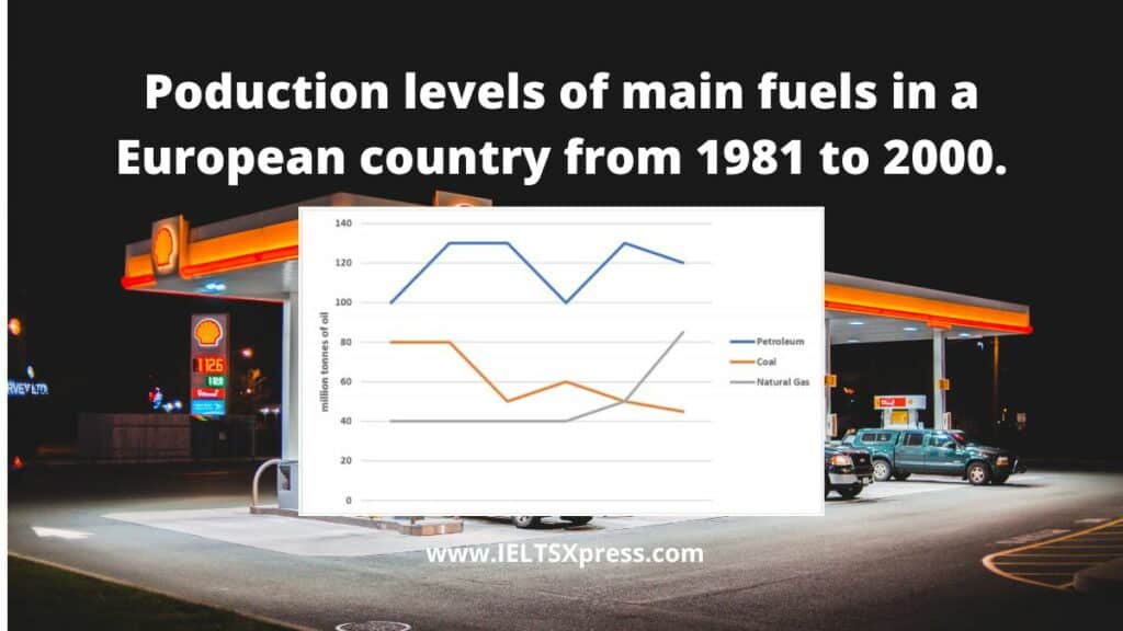
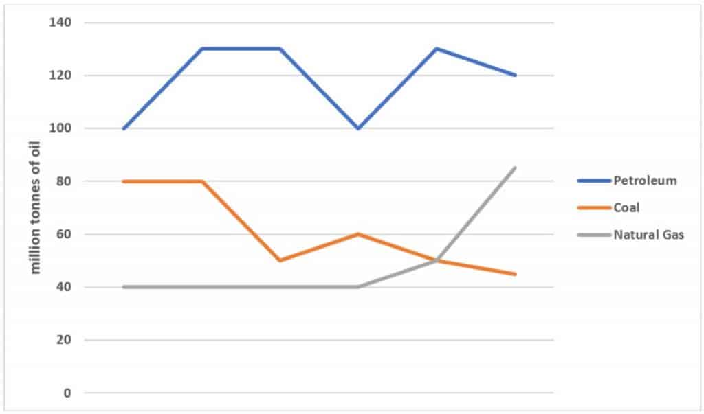
The graph below shows the production levels of main fuels in a European country from 1981 to 2000. Measured in tonnes.
Summarize the information by selecting and reporting the main features and make comparisons where relevant. Write at least 150 words.
Production Levels of Main Fuels IELTS Line Graph
Sample Answer 1
The given line graph shows the production levels of three main types of fuel (petroleum, coal, and natural gas) in a particular European country, from 1981 to 2000.
Overall, it can be seen that petroleum was by far the most produced type of fuel, while the amount of natural gas being produced was increasing rapidly.
In 1981, the amount of petroleum being produced was around 100 tonnes. It increased steadily over the next few years to reach around 130 tonnes before dropping back to just under 100 tonnes in 1989. It then rose up again to around 130 tonnes in 1995, where it fluctuated slightly until the end of the period.
Coal was the second most produced fuel in 1981, at 80 tonnes. Coal production remained constant until it dropped suddenly down to around 50 tonnes in 1985. It rose back up to just over 70 tonnes in 1987 before slowly declining over the next 13 years to just under 40 tonnes. The production of natural gas remained unchanged at about 40 tonnes until around 1991 when it began to rise exponentially.
Also Check: Percentage of Food Budget spent on Restaurant Meals


