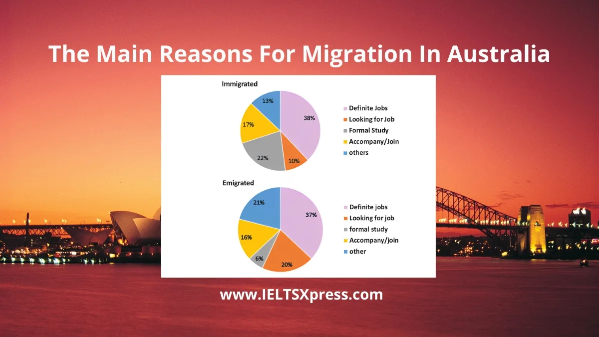
The Main Reasons For Migration In Australia Pie Charts
Discover key insights from The Pie Charts Show The Main Reasons For Migration In Australia. Learn how to describe data for Academic Writing Task 1.
Discover key insights from The Pie Charts Show The Main Reasons For Migration In Australia. Learn how to describe data for Academic Writing Task 1.

Discover key insights from a pie chart showing the native languages spoken by students. Learn how to describe data for Academic Writing Task 1.
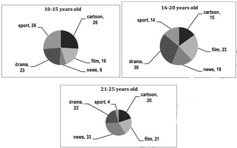
The graphs below show the viewership of different TV programmes among three different age groups IELTS Academic Writing Task 1 Pie Chart.
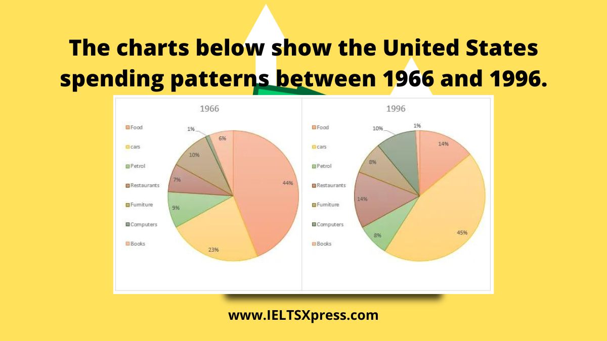
The charts below show the United States spending patterns between 1966 and 1996. IELTS Academic Writing Task 1 Pie Chart with sample answer.

The charts below show the percentage of food budget the average family spent on restaurant meals in different years. The graph shows the number of meals eaten in fast food restaurants and sit-down restaurants.
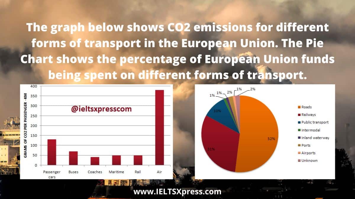
The graph below shows CO2 emissions for different forms of transport in the European Union. The Pie Chart shows the percentage of European Union funds being spent on different forms of transport.

The first chart below shows how energy is used in an average Australian household. The second chart shows the greenhouse gas emissions which result from this energy use.
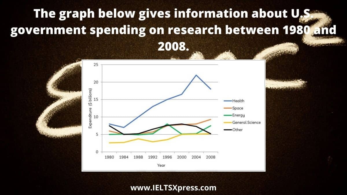
The graph below gives information about U.S. government spending on research between 1980 and 2008. IELTS Academic Writing Line Chart.

The charts below show the results of a survey conducted by a university library to find out the opinions of full-time and part-time students about its services.
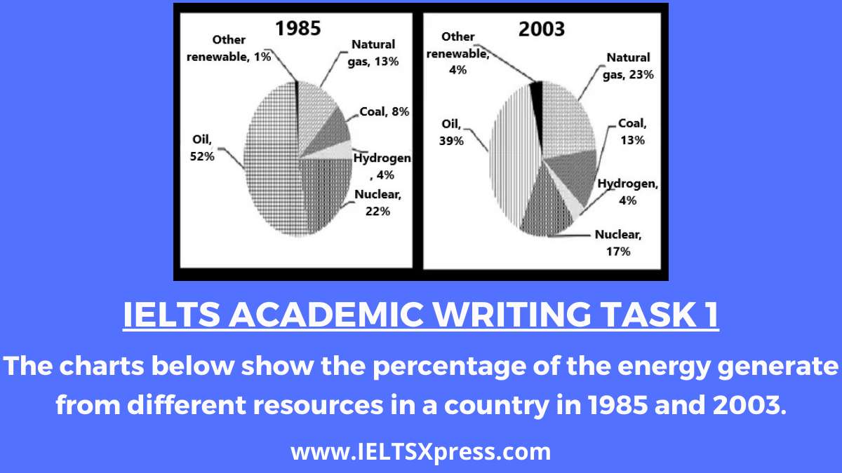
IELTS Academic Writing The charts below show the percentage of the energy generate from different resources in a country in 1985 and 2003.
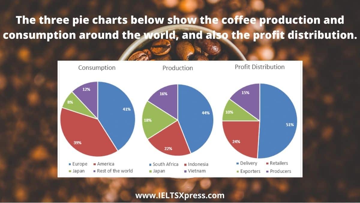
IELTS Academic Writing Task 1 The three pie charts below show the coffee production and consumption around the world, and also profit distribution