The Percentage of New Zealand Population Line Graph
You should spend about 20 minutes on this task.
Real IELTS Exam Question, Reported On:
Practice with Expert IELTS Tutors Online
Apply Code "IELTSXPRESS20" To Get 20% off on IELTS Mock Test
| India | 26th November 2022 |
The line graph shows the percentage of New Zealand population from 1950 to 2050.

![]() Summarise the information by selecting and reporting the main features and make comparisons where relevant. Write at least 150 words.
Summarise the information by selecting and reporting the main features and make comparisons where relevant. Write at least 150 words.
The Percentage of New Zealand Population Line Graph
Sample Answer 1
The given chart illustrates past changes and future predictions of the New Zealand population over a 100-year period from 1950 to 2050.
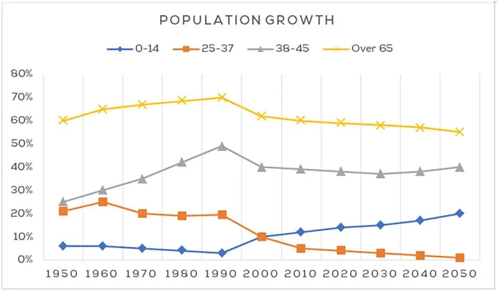
Overall, people aged 65 and over accounted for the highest percentage of the New Zealand population throughout the period, including the predicted future figures. In addition, while the figures for the 25 to 37 year-olds and over-65 year-olds are predicted to decline over the 100 year period, those aged 14 and under and 38 to 45 years-old are expected to increase. ieltsxpress.com
![]() From 1950 to approximately 1990, the percentage of people aged 38-45 and those aged 65 and over both increased from around 25% to 50%, and 60% to 70% of the population respectively. Both these age groups then started to decline and are predicted to continue declining until 2050 to reach approximately 40% and 55% respectively.
From 1950 to approximately 1990, the percentage of people aged 38-45 and those aged 65 and over both increased from around 25% to 50%, and 60% to 70% of the population respectively. Both these age groups then started to decline and are predicted to continue declining until 2050 to reach approximately 40% and 55% respectively.![]()
The graph shows the opposite trend for the remaining age groups with 25 to 37 year-olds making up around 20% of the population and people aged 14 and under making up about 5%. By 2050, it is predicted that those aged 14 and under will make up 20% of the population, while those aged 25 to 37 will only be a very small percentage.
The Percentage of New Zealand Population Line Graph
The infographic presents the population growth figures for New Zealand between 1950 and 2050. Overall, the general trend was for the population to grow over the first five years, yet it reversed to decline and will continue declining for the rest of the period surveyed. Meanwhile, the exception is for the youngest population figure which started to rise from the plateau and is expected to continue rising into the foreseeable future.
Noticeably, the two highest growth rates appear in the 38-45 and 65+ age categories throughout the timescale. While the former increased from 25% in 1950 to peak at nearly 50% in 1990, the latter simultaneously reached the peak of 70% from just over 60%. Both trends were subsequently reversed to significant decreases with their figures projected to continue reducing to just below 40% and roughly 55% respectively by the period’s end.![]()
By comparison, the two younger groups show far lower rates of growth. Starting from 20% in 1950, the 25-37 figure steadily peaked at only 25% in 1960, but then it started to fall and will continue the downward trend to reach a near-zero growth rate by 2050. In contrast, while the rate in the 0-14 age group remained static at 5% within the first four decades, it later climbed up to reach a high of 20%, registering a fourfold increase eventually. ieltsxpress.com


