Total Births and Deaths in a European Country IELTS Line Chart
You should spend about 20 minutes on this task.
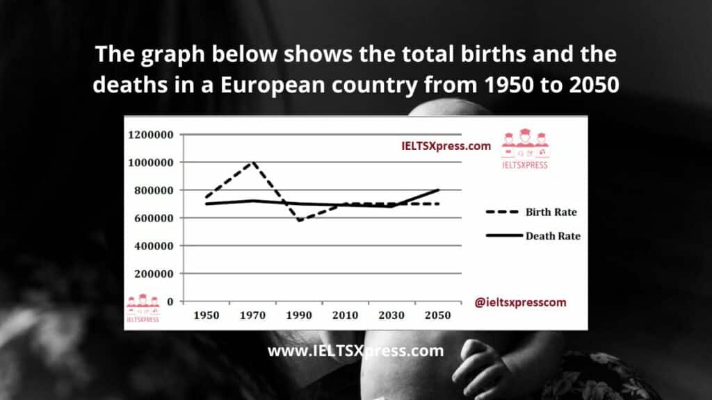
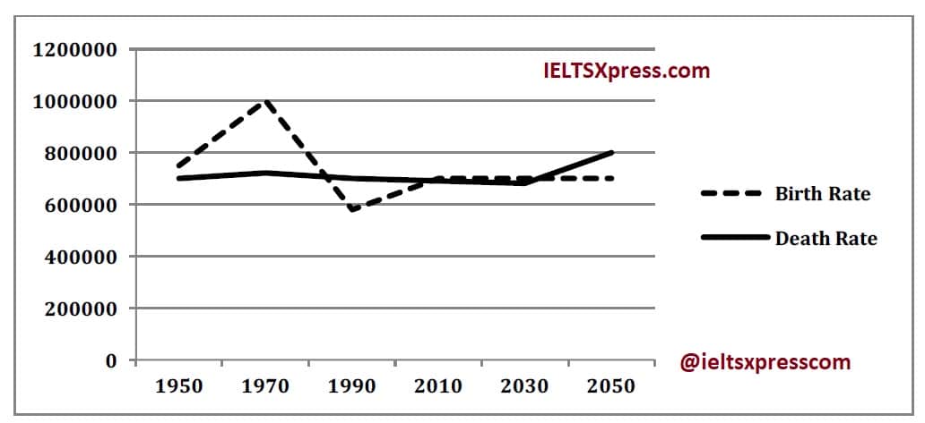
The graph below shows the total births and the deaths in a European country from 1950 to 2050.
Summarize the information by selecting and reporting the main features and make comparisons where relevant. Write at least 150 words.
Practice with Expert IELTS Tutors Online
Apply Code "IELTSXPRESS20" To Get 20% off on IELTS Mock Test
The graph below shows the total births and the deaths in a European country from 1950 to 2050
Sample Answer 1
The given line graph compares the Birth Rate and the Death Rate from 1950 onwards and also gives projections upto 2050. It is clear from a cursory glance at the graph that the Birth and Death Rates have been almost similar except for the 1970s when the birth rate was much more than the Death Rate. ieltsxpress
In 1950, the number of births in this country was roughly 750,000. After that the population of the newly born rose sharply and peaked at 1000000 in the 1970s. Then it dropped sharply to reach an all time low of a little under 600000 in the 1990s. From then on the birth rate picked up again and has reached approximately 700,000 and is predicted to remain stable till 2050.
The Death Rate has been fairly stable at around 0.7 million. It is expected to remain constant till 2030, after which it is forecast to rise and reach the 0.8 million mark by 2050.
Overall, the Birth Rate experienced fluctuations in the past, while the Death Rate remained stable. The Birth Rate is expected to remain stable after 2030, but the Death Rate is predicted to rise moderately till 2050.
Also Check: The Production of Olive Oil IELTS Process Diagram


