The Line Graph gives Data about the Number of Users of Five Communication Services
You should spend about 20 minutes on this task.
The line graph gives data about the number of users of five different communication services worldwide from 1998 to 2008.
Summarise the information by selecting and reporting the main features and make comparisons where relevant. Write at least 150 words.
The Line Graph gives Data about the Number of Users of Five Communication Services – Sample Answer 1
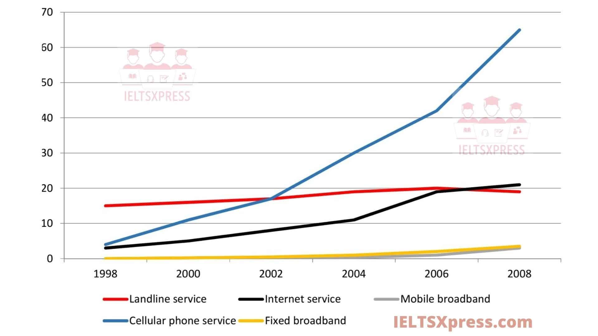
The line graph gives data about the number of users of five different communication services worldwide from 1998 to 2008.
Overall, all services experienced some growth over the 10 year period, with cell phone and Internet services experiencing the most growth and becoming the most popular forms of communication.
In 1998, the figures for cell phone and Internet users started at around 5% of the population. They both increased over the remaining years, with cell phone service gaining the highest position in 2008, with more than 60% percent of the population using this type of service. This number was approximately three times as much as that of Internet service in the same year.
Meanwhile, throughout the 10-year period, little change was seen in the use of landline services, at about 15% of the population. Also, the use of mobile and fixed broadband services was minimal before 2002. The figures for these two services rose slightly to roughly 5% of the population by the last year.
IELTS Academic Line Graph – Sample Answer 2
The line graph illustrates the number of people in the world who used five categories of communication services at two-year intervals from 1998 to 2008.
Overall, although all kinds of communication services tended to grow during the entire time period, only the increase in popularity in cellular phone service was significantly higher than the rise in that of other means of communication.
In 1998, the figure for cellular phone service was round about 500 people, as same as Internet service’s. From 1998, the number of individuals used cellular phone service increased dramatically to exactly 6000 people and became the most common mean of communication in the year 2008. Additionally, the figure for Internet service was about five times higher than during the period of 10 years.
With 1500 people used, the figure for landline service was the highest number in 1998. However, that figure had a minor increase to 2000 people in 2006 before it dropped slightly to approximately 1800 people in 2008. The figure for mobile broadband and fixed broadband remained nearly 0 throughout the first six-year period. They were also the least popular kinds of communication services despite of rising up to 500 people in 2008.
Also Check: The Three Pie Charts below Show the Coffee Production and Consumption


