
IELTS Academic Writing Task 1 – Two charts below show the percentage of qualified graduates
Real IELTS Exam Question, Reported On:
| India | 17th February 2022 |
You should spend about 20 minutes on this task.
Two charts below show the percentage of qualified graduates in a particular country. Summarise the information by selecting and reporting the main features and make comparisons where relevant.
Write at least 150 words.
Practice with Expert IELTS Tutors Online
Apply Code "IELTSXPRESS20" To Get 20% off on IELTS Mock Test
Two Charts below Show the Percentage of Qualified Graduates – Sample Answer 1
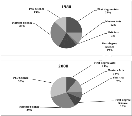
The given pie charts depict the proportion of graduates who held various degrees in a given country in 1980 and 2008. It is clear from the charts that the First degrees in Arts and Sciences lost popularity whereas the Masters and Doctoral courses gained popularity after a period of nearly three decades.
In 1980, a quarter of the graduates held a first degree in Arts, whereas only 12% went for Masters in Arts and a very small minority (2%) went for PhD in Arts. First degree Science graduates were a little under a fifth where as the Masters in Science graduates were nearly a third of the total. Only 13% held PhD degrees.
In 2008, Graduates holding Masters in Arts and Sciences were 11% and 10% respectively. This percentage was considerably less as compared to that of 1958. The proportion of Masters in Arts and Science graduates was almost similar to that of 1958. PhD degree holders in Arts grew significantly from 2% to 7% and the PhD in Science was held by 30% which was also much higher than the figures of 1958.
Overall, it is interesting to see that undergraduate or the first degree courses became less popular over time but the graduate courses were pursued by more people.
IELTSXpress
Pie Charts Below the percentage of qualified graduates – Sample Answer 2
The given pie charts illustrate the proportion of graduates with various degrees in a given country in 1980 and 2008. The charts show that first degrees in the arts and sciences have fallen out of favor, while graduate and doctoral courses have gained in popularity after a period of nearly three decades.
In 1980, a quarter of graduates had a first degree in arts, while only 12% received a master of arts degree, and a very small minority (2%) received a doctorate in arts. First-degree Science graduates made up just under a fifth, while graduates with a master’s degree in science accounted for almost a third of the total. Only 13% have a Ph.D.
In 2008, graduates holding a Master of Arts and Sciences were 11% and 10% respectively. This percentage was significantly less than in 1958. The share of graduates of masters of arts and sciences was almost the same as in 1958. The number of PhDs has grown significantly from 2% to 7%. by 30%, which is also significantly higher than in 1958.
Overall, it is interesting to see that undergraduate or first degree courses have become less popular over time, but more people have attended graduate courses.
Also Check: The Three Pie Charts below Show the Coffee Production and Consumption


